Wondrous World of Wall Panelling!
7 styles you’ve got to know about to instantly elevate your space!
I love wall panelling! And here's why. I'm a neutral at heart, and I love beige. And when people say beige is boring, I'm the first to say they're wrong. You just haven't seen neutrals done in a way that's not plain and basic. I feel like we rely too much on paint to tell the story and not enough about layering and texture.
I reckon it's mainly from our obsession with minimalism. Sure its a gorgeous style and has its place. But I feel like it stopped us all from seeing the variety of styles and textures we can incorporate into the shell of our space. Furniture shouldn't be the only thing that makes a space. One fantastic way to instantly amplify any space is through the use of panelling.
Not only that, but it's pretty affordable. There are a few useful renter hacks too! But for now, let's explore the styles found within wall panelling. Its not all 70's ochre panels or industrial stacked timber feature walls. Let's go!
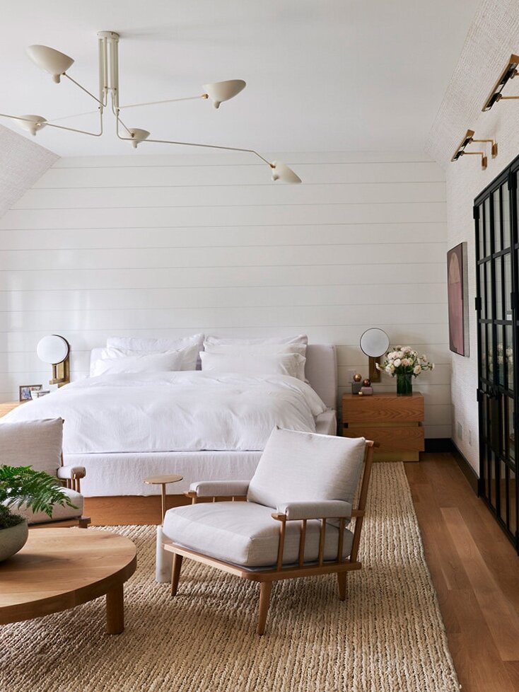
Shiplap
If you've been paying attention to trends the past few years, you'll know the good old classic shiplap. Grooved boards are Horizontally running stacked closely together to create a weatherproof seal. Coined as the "Farmhouse" go-to this style can be seen in a more nautical sense too. Think more boathouse than farmstead.
Originally, shiplap was the base layer that was originally used to build up a wall's strength before layering with plaster.
Shiplap is an understated architectural detail that just instantly adds warmth and softness to a space. it's a soft visual that can go unlooked and only allow a space to feel cosy, yet fresh all at the same time.
Board And Batten
Board and batten, or board-and-batten siding, is a more minimal, budget and commitment friendly approach to wall panelling if you were to ask me. It almost feels like the contemporary upgrade of shiplap.
Initially, this style only was seen on external walls, like barns and sheds. It has alternating wide boards and narrow wooden strips, called "battens." The panels are usually (but not always) 1 foot wide, vertically and are generally about 1/2 inch wide.
If you're more the minimalist type, id highly recommend this style of wall treatment. I love how streamline and how, contrary to its origins, sophisticated it is.
If you have a low ceiling, this vertical style of panelling with instantly draw the eye up and make the room appear much more extensive. Its an added three-dimensional elements that's easy on the eyes, budget and to install!
Beadboard
An overlooked classic to the wall panelling world. Its honestly considered a little more cutesy—a tad whimsy and cottage-like.
Beadboard is a row of narrow wood planks lined up vertically on the wall. In between each wood, plank is a little indentation or ridge—also known as a "bead". The vertical boards get capped off by strips of horizontal moulding, which finish off the seams.
It's a beautiful style of panelling that really can add warmth and make a space feel quaint. Which honestly, is lacking atm. So a bit more quaint is what we all need. Come to think of it "quaint" is such a better word than "cute" or "cosy" and means those two words combined.
So start using quaint more in your day to day language, and hopefully, we'll see more of beadboard!
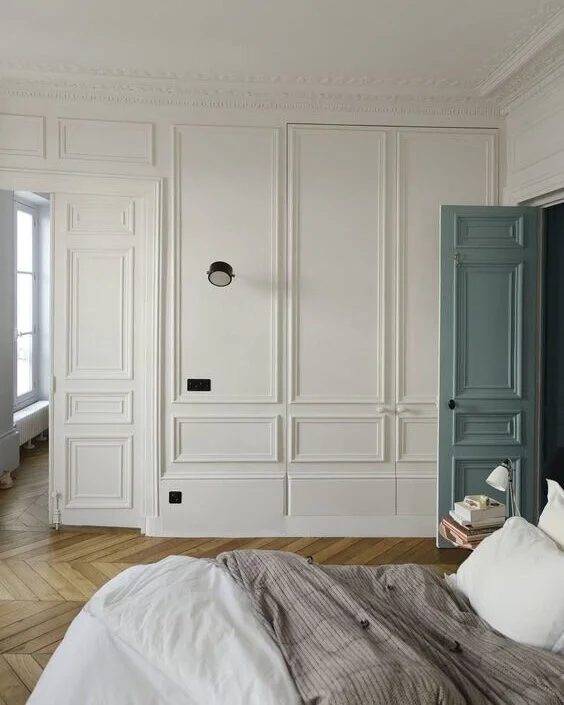
Flat Panels
Flat panels are kind of like the older sister to board and batten in my eyes. Sure they come from entirely different worlds.
But from a contemporary standpoint, I feel like board and batten is a bit more relevant. Given that panelling was/has been done to death and filtered down into that real commercial market.
Which, in the end, loses its appeal and origin.
It can produce clean lines and an unmistakable polished look. The flat panel style originated in the 19th century and has grown in popularity over the years. It's a more straightforward approach to the more formal looks of raised panels.
Keep things simple yet exciting with the use of flat panels.
Wainscoting
This is similar to flat panels except instead of the frame standing out from the wall, its almost as though the frame is the wall and the squares are carved out. So they vary. It’s a series of boxes along the bottom portion of a wall, topped by decorative Chair rail & bordered by a beautiful Skirting Board achieve the look are what makes a Wainscoting design.
Think 1990's American dream home with the white picket fence. It's a very exquisite style. It's also understated. You know that old money don't make a fuss about it kind of panelling. A gentleman's lounge or study kind of panelling.
Its certainly a gorgeous style of wall panelling that comes a variety of heights and styles and its also, super expensive! Haha But if you have a more traditional home or are leaning down that style of space then it is definitely worth the investment as it doesn't usually date ever and honestly, I feel like it'll add value to your home in the long run.
Square Tudor panelling
Tudor panelled walls, which have medieval origins, are frames of stiles and rails holding many small panels, 12-inch And 16-inch Squares. Once again there can be styles of this. One where panels are laid on top of a flat wall. Or have it appear as those the frames were the first wall and it has been dug out.
I do like this style of panelling; however, I feel like its a very "I studied interior design, and I want to make an impact!" Kind of style.
Which isn't a good thing.
I feel like flat panels, it's a somewhat over commercialised type of panelling. However, if you do a small amount, say running down the side of a stairwell or even built out more onto a ceiling, than that's a great way to make a wow impact without it feeling 'cheetah print and gold, or charcoal corporate, blackboard paint-esque.' I hope my analogies make sense haha!
Full wall panelling
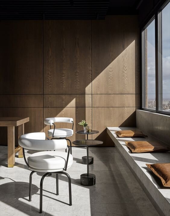
This style of wall treatment is for those massive city skyscrapers who have wall to ceiling timber panelling—used to make a rather clinical space feel warmer. But still oh so sophisticated and corporate at the same time.
It is like the new money version of wainscoting.
You'll catch it in architectural new builds and skyscrapers. When you see it, you know architects have done it.
Very 'luxury.' But like a lot of luxury, it doesn't mean it's stylish. So you can go wrong with this style and spend a whole lot of money in the process.
Well! I feel like I have cleansed a part of my soul.
I loved writing this journal entry because so often I speak to people about how different panel styles could take their space to the next level and it's a whole new world for them that they've never explored. I say we ditch the gyprock and bring out the texture! Until next time check out my other blog posts and keep up to date on my daily adventures on Instagram and TikTok!


