Vogue Living Cover Look For Less! - Athena Calderone
A Room Worth Over $100,000 For Just $5,000!
Vogue Living Australia’s Spring edition is featuring everyone’s favourite do-all NYC based designer Athena Calderone’s townhouse. You can find her house all over socials and every print publication imaginable the past two years and there’s no real need to explain why. This new age eclectic french style is the perfect example of introducing a more considered, eclectic and maximalist approach to design, which is where we are all headed when you look around: Goodbye mid-century minimal, hello antique collectables and old-world charm.
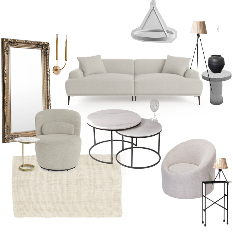
So if you’re a total fan and want to introduce a bit of this style into your own home, I’ve got you covered. Athena’s collector items are very niche and hard to come by tbh. And when you do see them, they’re mega expensive. We’re talking full haute couture here in the furniture world. So I have pulled together a couple of affordable alternatives (for less than the original couch) to get the ball rolling. Click on the images below to shop the looks, and I hope you enjoy!
Sofa
Athena’s Mario Bellini for B&B Italia sofa will set you back a whopping $34,500! It’s certainly beautiful and Italian so go-figure. I kept the colour and shape of the design in mind when selecting this BROSA alternative. I feel like you’re still getting the curved streamline shape and the light colour palette for way less.
Chairs
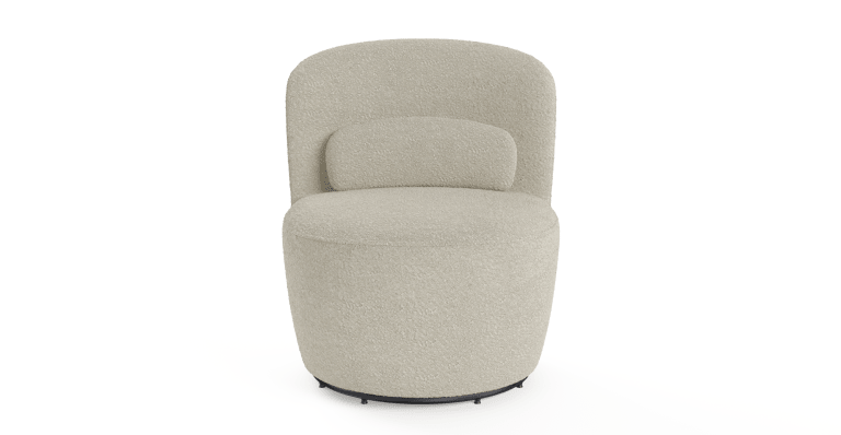
I think this little boucle moment is a cute swap for Athena’s round accent chair. Not only is Boucle having a total resurgence but this shape and colour matches that light, Parisian aesthetic that’s happing in amongst the space.
Sitting rooms are charming. I think this movement to having more seating in amongst our living room spaces is coming from wanting to connect with people more. Putting the phone down and opening up a physical dialogue. Which is why I think this dome-like chair will go well with the other chair and sofa in this space. Similar to the ones seen in the original shot. Everything is feeling connected but unique at the same time.
Mirror
Of course, the large gold mirror is a stand out in amongst this space. Its a very romantic, Parisian style that doesn't date but certainly can go south if there's too much ornate going on in the space. I think just the one piece gives the grandeur and romance one may be looking for. I believe this alternative ticks the boxes. Great price and size to rest up against a wall or hang up if you have the space.
Coffee Table
I love Athena's pyramid, block marble coffee table plinths. But let's be real, these cost a pretty penny. So I kept the overall shape, material and tiered effect in mind when opting for these marble coffee tables. I also think that the black needs to be introduced somewhere given, not all of us are going to have a large black marble fireplace. So this is a good starting off point for bringing in those darker elements.
Side Table
I this is to replace that antique stool sitting beside the accent chair. This brass and marble side table is delicate, ties in with the shapes within the space and the materials seen in the coffee table and wall sconces. So work perfectly as a character piece.
This more medium-sized side table is in place of the one seen beside the sofa. Very similar shape and style and a bit of rough texture to add in some warmth.
And finally, this iron piece here to connect and tie in those black features again and be a stand-in next to the other accent chair like seen in the original image. (Down on the left-hand corner, the mini tall book stand.)
Lighting
It was super challenging to find lamps that were the right size and style. These are from target would you believe!? I feel like the size of the shades and rattan/iron look matches in perfectly with the reference shot. Sure it's not as curved and French-esc. But still a great nod to the style. And for the price its a total steal!
Decor
So we see a lot of urns, vessels and earthy decor throughout the space so I feel like this Papaya vessel is a great size and option to style with on top of one of the side tables (most likely the one next to the sofa.)
This face decor item is just great piece that instantly adds depth and roughness to the space to give it a collectors feel. Injecting a put more rough edged pieces that are more Indonesian adds a global, antique feel that makes the space a bit more approachable and interesting. An item for the coffee table or mantle (th’s if you’ve got one!)
Rug
Like we know, rugs cost a fortune. I always opt. For jute where possible. Because the more extensive the rug, the better and these jute style rugs are the best bang for buck, it resembles the natural/white combo seen in Athena’s space nicely I think and further grounds the space in terms of its organic look and feel.
Pendant
At first, I didn’t think to add in light fixtures. However, if someone owns their place, then here’s a light that I think is a great affordable option. Like I said earlier, I think the mirror is doing enough in the eclectic glamour department. So the light needs to be a bit more streamline and contemporary in look and feel. Especially given I’m imagining your space is going to be more down the contemporary side than that of Athena’s gorgeous brownstone Brooklyn apartment. This light will still spark the same shapes, finishes and colour seen throughout the space. But will further tie in and be the accent piece that connects the furniture to the rest of your home/architecture.
This brass wall sconce continues to connect the mirror, small accent side table together in amongst this white, beige, black and brass space. I think you need around three items in a room to contain similar shapes, finishes and colours to make the space feel more complete and cohesive. So this works great! Not only that, but it's in a similar vein to the one in the original image.
And there we have it! Collect a few more decor items, and I think we've nailed the brief here! One gorgeous, contemporary, french inspired space with an eclectic, collector feel. Very 'in vogue' if you will - get it?
Anyway, I hope you enjoyed this entry. I may continue the series on further to showcase this style of "get the look on a budget" and "shop the look."
If you'd like a more personal approach, visit my digital design service where I put together a shoppable list and mood-board with your images in your space to get that custom look for way less!
Until next time!


